Creating a tranquil and inviting atmosphere in your home starts with choosing the right colors. Calm colors can transform any room into a soothing retreat, helping you feel relaxed and refreshed. Whether you want to redesign a single room or your entire house, selecting calm colors can have a significant impact on your mood and overall comfort.
In this post, we’ll explore practical tips for choosing calm colors for your home, including popular color options, how to combine shades, and expert advice on using color psychology to create peaceful spaces.
Why Choose Calm Colors for Your Home?
Calm colors are typically soft, muted, and understated shades that inspire a sense of peace and relaxation. Unlike bold or bright colors, calm tones don’t overwhelm the senses. Instead, they provide a gentle backdrop that promotes rest and focus—perfect for bedrooms, living rooms, bathrooms, or any space where you want to unwind.
Many people find that calm colors help reduce stress and create a harmonious balance in their living environment. Choosing these hues thoughtfully can also enhance natural light and make a room feel larger and airier.
Popular Calm Color Choices
Here are some widely used calm colors that work well in various home settings:
– Soft Blues: Blue shades evoke feelings of tranquility and stability. Light blues and dusty blues are especially calming.
– Muted Greens: Green connects us to nature and promotes balance. Sage and olive greens are popular calm color choices.
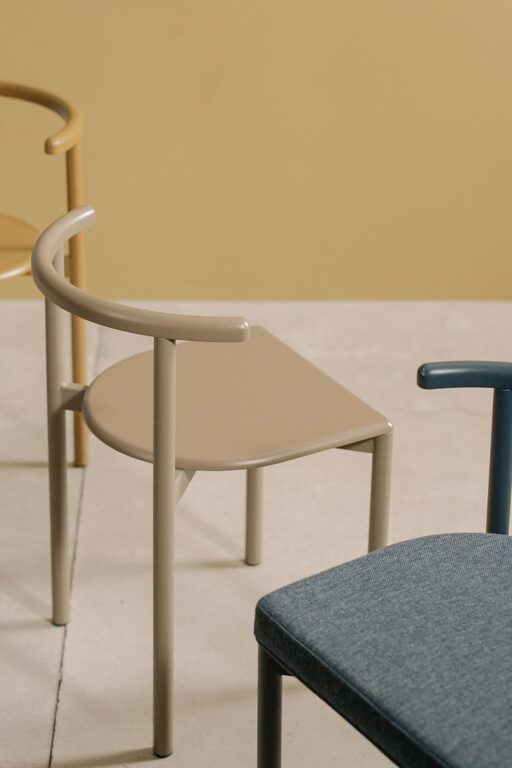
– Warm Neutrals: Shades like beige, taupe, and soft greys provide a cozy, neutral foundation that pairs well with other colors.
– Lavender and Soft Purples: These colors bring a gentle sense of calm and can add subtle warmth without overpowering a room.
– Pale Pinks and Peaches: These soft colors offer comfort and a touch of warmth, creating a cozy feel.
– Whites and Off-Whites: Crisp or creamy whites brighten spaces while keeping the atmosphere peaceful.
Tips for Choosing the Right Calm Colors
1. Consider the Room’s Purpose
Think about how you intend to use the space. Bedrooms and bathrooms benefit most from very soft, serene colors that promote restfulness. Living rooms and kitchens can handle slightly warmer calm tones that inspire socializing and comfort without being too stimulating.
2. Test Colors in Different Lighting
Natural and artificial lighting can change the appearance of your chosen color. Before committing, test paint samples on different walls and observe them at various times of day. You’ll get a more accurate sense of how the color works in your specific space.
3. Use Color Psychology
Understanding basic color psychology can guide your choices:
– Blue calms the mind and lowers stress.
– Green balances and refreshes.
– Neutrals stabilize and ground.
– Soft purples enhance creativity and spirituality.
– Warm pinks soothe emotions.
Choose colors that resonate with the mood you want to create.
4. Combine with Texture and Patterns
Calm colors don’t need to be boring. Pair gentle shades with textured fabrics, patterned rugs, or subtle wallpaper to add visual interest while maintaining a peaceful feeling.
5. Use an Accent Color
Incorporate one or two accent colors in deeper or complementary tones to add dimension without overwhelming the room. For example, a sage green living room might feature darker green cushions or wooden elements.
6. Choose the Right Finish
Matte or eggshell paint finishes work best for calm rooms because they avoid glare and reflection, adding to the softness of the color.
How to Use Calm Colors Room by Room
Bedroom
Opt for light blues, muted greens, or soft greys. Pair with white bedding and natural materials like cotton or linen. Avoid overly bright or dark colors that may interfere with relaxation.
Living Room
Warm neutrals with touches of soft lavender or dusty pink can create a welcoming, calm space. Introduce calming tones through upholstery, curtains, or wall paint.
Kitchen
Light greens or soft beige can freshen up kitchens without being too clinical. Add wooden accents for warmth and texture.
Bathroom
Soft blues and pale greys mimic the feel of water and cleanliness. Use matte finishes on walls and soft towels in complementary shades.
Additional Tips for Enhancing Calmness
– Declutter: A clean, organized space supports calmness, regardless of color.
– Incorporate Natural Elements: Plants, wood, and stone compliment calm color schemes.
– Balance with Lighting: Use soft, warm lighting to enhance calming hues.
– Use Aromatherapy: Scents like lavender or eucalyptus can enhance the feel of a calm room.
Final Thoughts
Choosing calm colors for your home is an excellent way to encourage relaxation, reduce stress, and create a welcoming environment. Focus on your preferences, the room’s use, and how colors make you feel. By combining calm shades with thoughtful lighting, textures, and accents, you can transform your space into a peaceful haven that supports well-being every day.
Remember, creating a calm home is a personal journey, so don’t be afraid to experiment and find what truly works for you. With these tips, you’re well on your way to selecting colors that bring serenity and balance into your living spaces.